Visualizing EU Shipping Emissions on a 3D Globe
2026-02-28 · 7 min read
The EU publishes every large ship's annual CO₂ emissions in a spreadsheet.
It's called THETIS-MRV. Around 12,000 vessels per year, going back to 2018. How much fuel each ship burned, how much CO₂ it produced, who operates it, what flag it sails under. All public, all free.
Nobody really looks at it.
The data sits in Excel files on EMSA's website. If you want to compare shipping companies or see how emissions shifted during COVID, you're scrolling through thousands of rows. There's no visual, no map, no way to get the big picture.
I wanted to see what it looks like on a globe.
Seafloor covers 2018 to 2024. Around 86,000 vessel-year records total.
The data
THETIS-MRV is the EU's public ship emissions database, run by EMSA. Every large ship entering an EU port has to report its annual emissions. Not voluntary. EU law. Around 12,000 vessels per year, each with CO₂ totals, fuel consumption, distance traveled, ship type, operating company, and flag state.
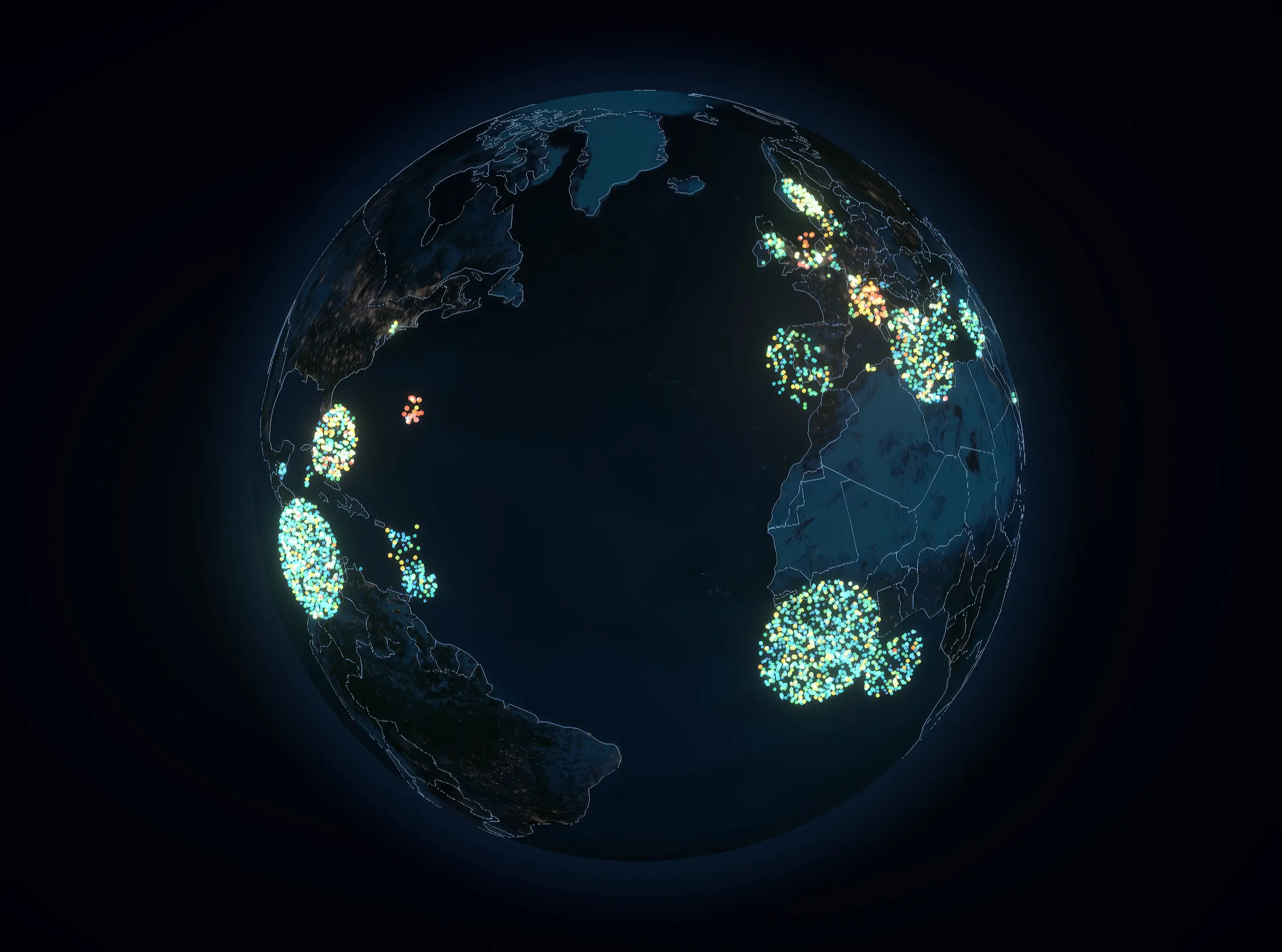
The flag state part is interesting. Ships aren't registered where their owners are. Greek companies register in Liberia. German companies flag in the Marshall Islands. Open registries. Lower taxes, less regulation. Panama, Liberia, and the Marshall Islands are the world's largest open registries. In this dataset, more vessels fly those three flags than any others.
On the globe, this is immediately visible. The biggest clusters aren't in Europe or East Asia. They're in Central America, West Africa, and the Central Pacific. The geography tells you how the maritime industry actually works.
2024 is also a turning point. That's the first year ships had to pay for their emissions under the EU Emissions Trading System. Around €65-70 per tonne of CO₂. At full ETS rates, MSC Shipmanagement Ltd, one of three MSC entities in the database, faces €373 million in annual carbon costs across 374 vessels. In 2024, companies owe 40% of that. It rises to 70% in 2025 and 100% from 2026.
Rendering 12,000 ships
The naive approach would be to create a mesh for each vessel. That's 12,000 draw calls per frame, which is roughly 11,900 too many for 60fps.
Instead, every vessel renders through a single InstancedMesh. One geometry, one material, one draw call. Each vessel gets a slot in an InstancedBufferAttribute with its position, color, and metadata encoded as floats. The GPU handles the rest.
The color for each dot comes from a logarithmic ramp. Raw CO₂ values range from a few hundred tonnes to over 125,000, so a linear scale would make everything look the same. Log-scaling spreads the distribution out. Blue for low emitters, through green and yellow, to red and pink for the heaviest polluters.
Switching years is just swapping the buffer. No geometry rebuild, no new meshes. The binary files are fetched once and cached, so year transitions are near-instant after first load.
The stack is React Three Fiber and Three.js, running on Next.js with a static export.
Why binary, not JSON
The first version used JSON. About 4MB per year, thousands of objects to parse, all of which had to be converted into typed arrays before the GPU could touch them.
The binary format skips all of that. Each year is a flat file of 11 floats per vessel. Fetch it, slice off a small header, pass it straight to the GPU. No parsing, no intermediate objects. Files dropped from 4MB to about 500KB.
Vessel names and metadata that the UI needs live in a separate JSON index. The binary handles rendering. The JSON handles lookups.
The zoom problem
At overview zoom, the globe looks cinematic. Dense clusters glow, you can see the global pattern. But zoom into one of those clusters and it falls apart. Soft circular falloff on each point, additive blending stacking brightness, bloom amplifying all of it. Instead of individual ships, you get a white blur.
The fix was making everything zoom-aware. Point size scales inversely with camera distance. The fragment shader tightens its edge falloff when you're close. Bloom intensity drops. At far zoom, clusters glow. At close zoom, you see distinct dots with subtle color. The transition is smooth because all three parameters read from the same camera distance uniform.
What you can actually do with it
You can search for any vessel by name or IMO number. The globe rotates to center on it and shows a detail card with emissions data. You can search by company to highlight an entire fleet. MSC's 374 ships light up across a dozen flag states.
There are three color modes. CO₂ total shows who pollutes most in absolute terms. EU ETS cost shows the financial exposure. Ship type mode colors vessels by category so you can see where the tankers cluster versus the container ships.
Filters let you narrow by ship type or flag state. The time slider covers 2018 to 2024, so you can watch the fleet evolve. There's a visible dip in 2020-2021 if you're looking for it.
The whole thing runs client-side. Static export, no server, no API. The data files are baked in at build time and served from Cloudflare Pages.
Source
The repo is open source. The data pipeline, the shaders, the binary format, all of it.
If you work in maritime and spot something wrong with how I'm interpreting the data, I'd genuinely like to know.